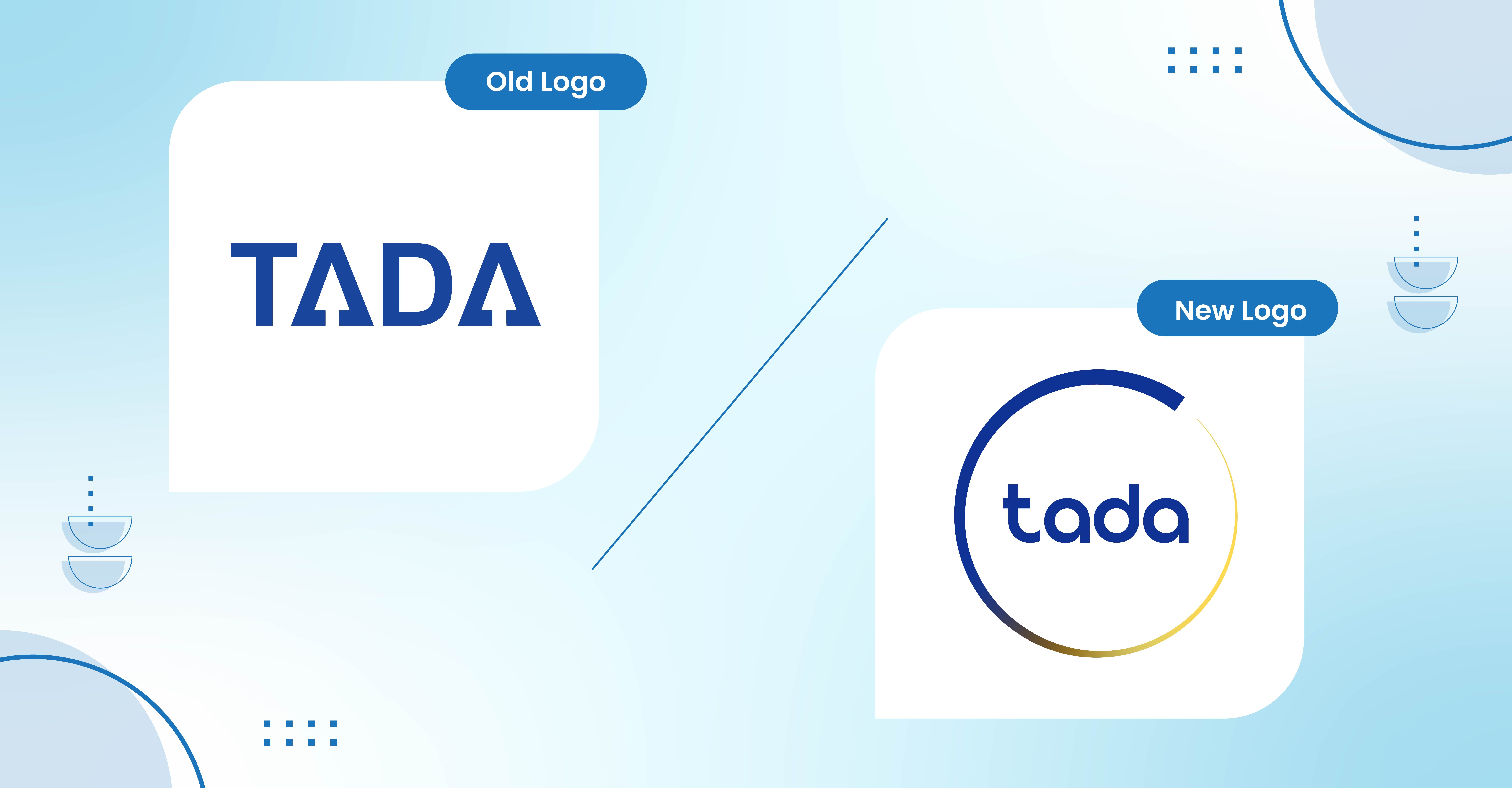
We are happy to announce the launch of our new Tada logo, marking an exciting milestone in the ongoing evolution of our company's brand.
Our professional profile has grown and evolved since we first launched in 2012, and now it is time to refresh it. We have altered our logo to reflect who we are today and to symbolize our dynamic future.
With a lot of creativity sessions, we have chosen a new logo that is modern with key elements that convey our mission to help brands achieve their goals with loyalty program, customer retention and employee engagement, while remaining true to our longstanding reputation.
Fresh New Look
It is a completely a new look for Tada that better matches the transformation we’ve made as a company. At Tada, we are fully committed to deliver excellent services to each of stakeholders; clients, partners, users, employees, and also investors.
You’ll see this new logo anywhere we’re out in public, like website (which also has a new sleek design), LinkedIn, Facebook, Instagram and also Twitter.
We have chosen a new logo that is modern with key elements that convey our mission to deliver excellent services to each of stakeholders; clients, partners, users, employees, and also investors, while remaining true to our longstanding reputation.
There are two major differences that we want to bring up here.
1. Our new logo was inspired by ensō symbol
.jpg?width=4168&name=Tada%20new%20logo%20(3).jpg)
The ensō (円相, "circular form") symbolizes strength, elegance, and the universe. It is characterized by a minimalism born of Japanese aesthetics. In the former case, the circle is incomplete, allowing for movement and development as well as the acceptance of imperfection as perfect.
It also represents the spirit of harmonious cooperation, personal development and refinement of character, the visible and the invisible, simplicity, completeness, and a perfect harmony.
Tada’s new logo comes in two colors; blue and gold. These colors are symbolic of trust, convenient, friendly, technologically advanced and secure, which represent our mission to help our clients to retain their customers, employees, distributors and dealers through our innovative platform.
Meanwhile the perfectly imperfect cycle with gradient symbolizes how we acknowledge that we are not perfect, yet we always strive for perfection in whatever we do.
2. From upper-case to lower-case letter
.jpg?width=4168&name=Tada%20new%20logo%20(2).jpg)
We change significantly our font and its size to convey our message better. At Tada, we strive and committed to strongly support our client and stay humbly before the brand.
The simpler font selection also symbolizes our desire to simplify things and keep everything simple in everything we do; from communication to products and our services.
New Sleek Design for Our Corporate Website
Along with announcing our new brand logo, we have revamped our corporate website too; https://www.usetada.com/. The new site comes in a modern, clean, and organized layout to provide visitors with easy access to our solution information, highlighting our capabilities in omnichannel loyalty program, reseller program, and employee engagement.
The new logo and website reflect the growth-minded culture of our company and are designed to inspire and further elevate us as we continue to provide loyalty and retention solutions for our current and upcoming clients.
The logo change will not involve any modifications to the nature or operations of the company, nor will it in any way affect our existing relations with our clients and partners.
We hope you like our new look!

.png)
